The Tulsa Health Department is a local health agency committed to serving Tulsa through accessible programs, services, and education. They sought to modernize their website and improve access to vital health resources.
UX Research
Information Architecture
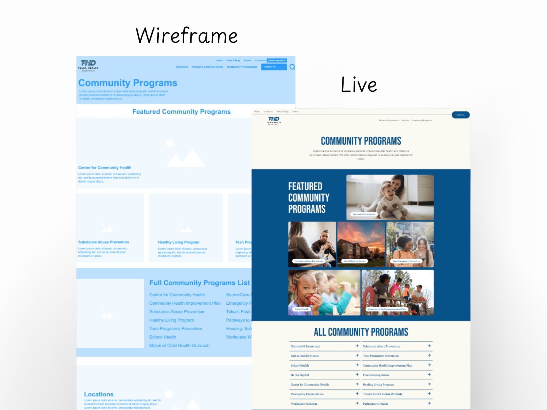
Wireframe
Web Design
Web Development
PROJECT CREDITS
Agency Project
This 2023 project was completed through Littlefield Agency, where I contributed as the Lead Developer & UX Strategist alongside a talented team of designers, copywriters, and marketing specialists.
Post-launch, the new website saw stronger engagement, longer session durations, and fewer drop-offs. Users could easily find and act on key resources, supporting the department’s mission to promote a healthier Tulsa.
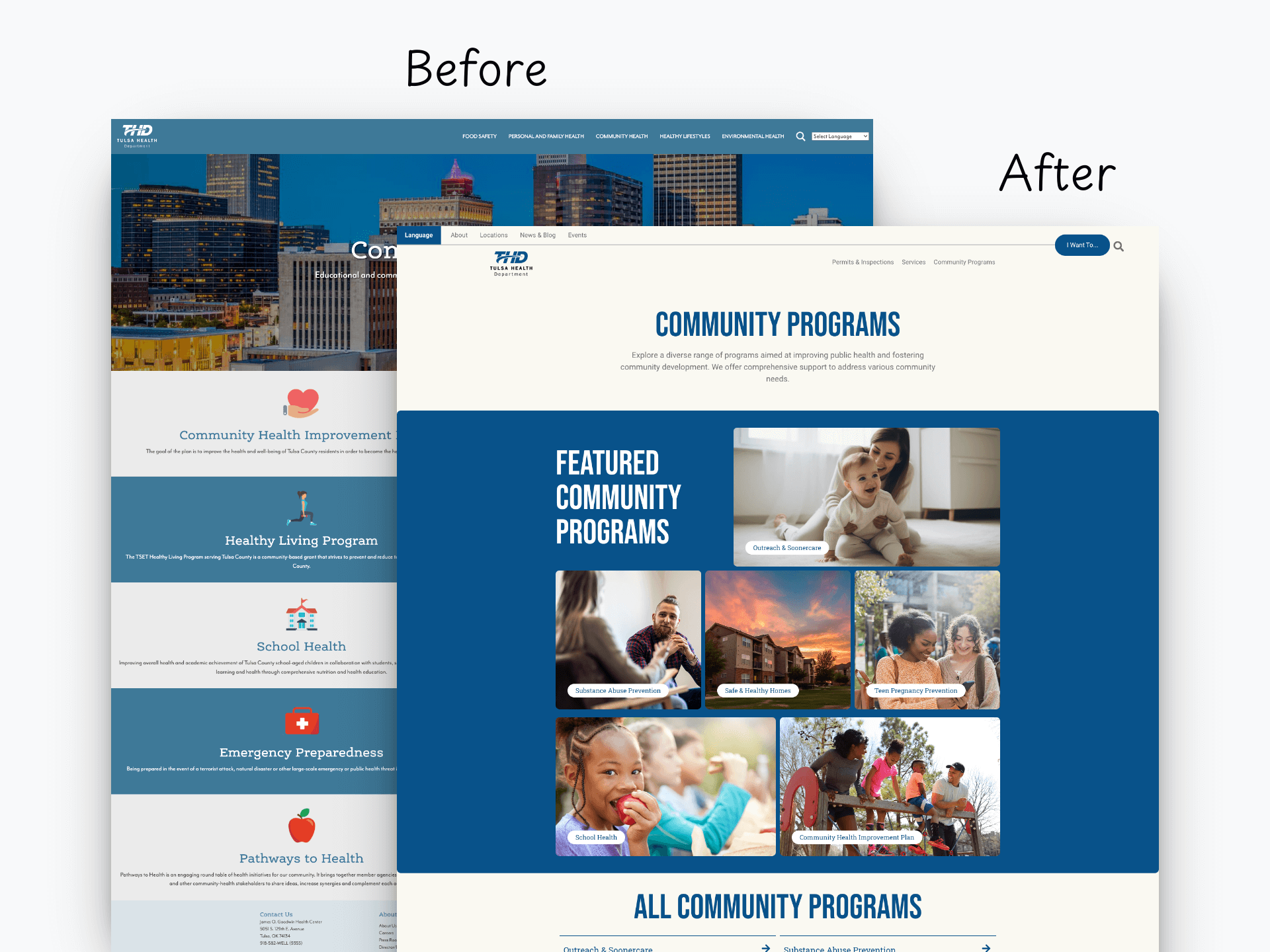
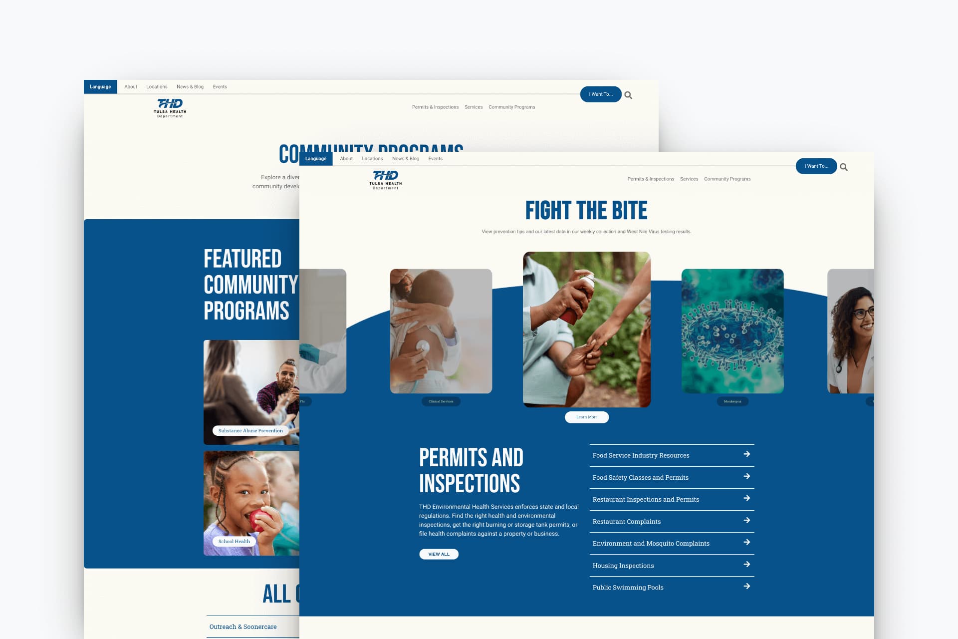
Updated Web Design for Home Page & Community Programs Page
The Challenge
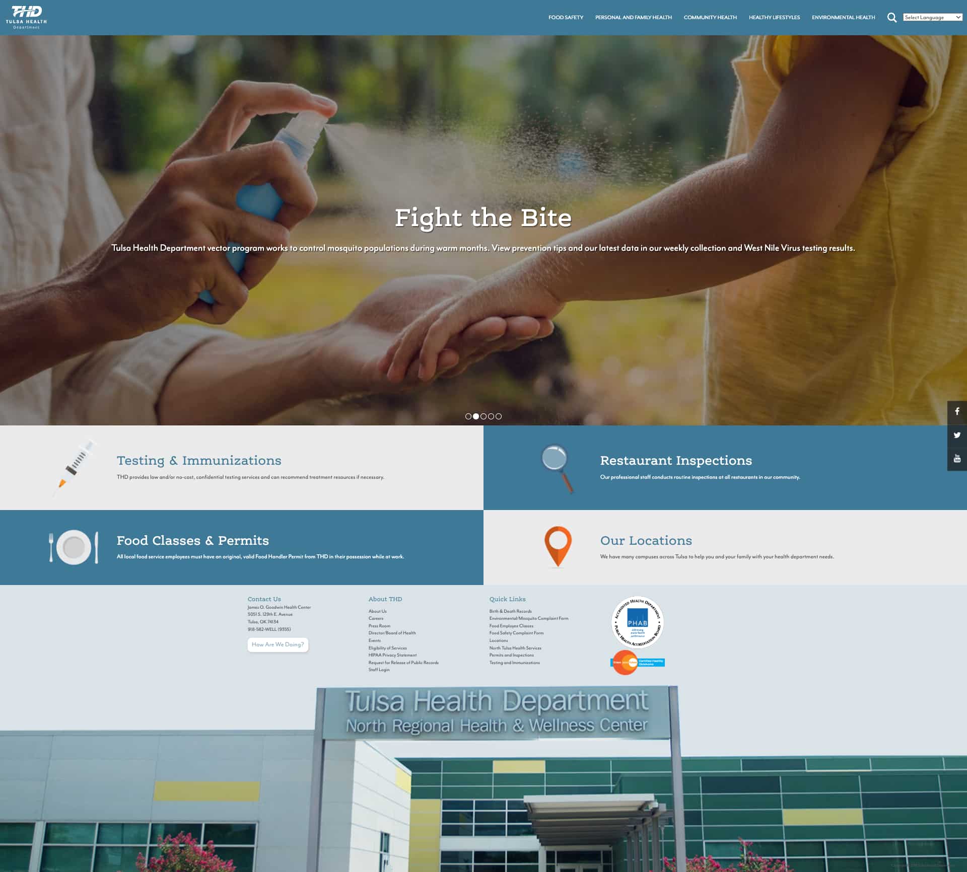
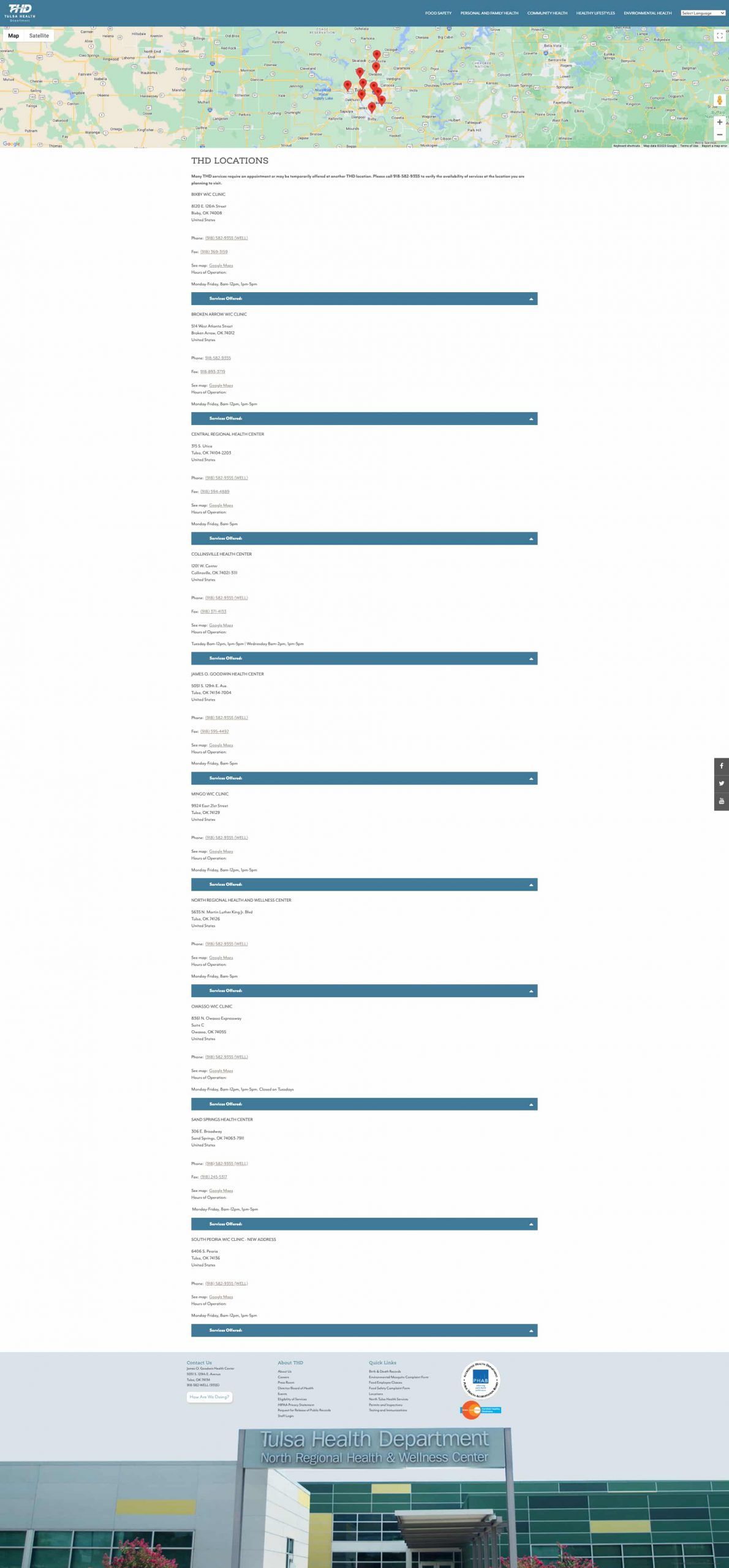
Outdated Design, Missed Opportunities
The previous website suffered from poor visual clarity and limited navigation. Users struggled to find important health resources and faced inconsistent content layouts that did not scale well across devices.
Confusing Site Navigation
Vague navigation and content grouping made it difficult to find resources on different devices
Ineffective Search Features
Irrelevant or limited search results restricted users from quickly finding specific information
Vague & Hidden Resources
Essential forms and documents were impacted by inconsistent design and lack of prominence
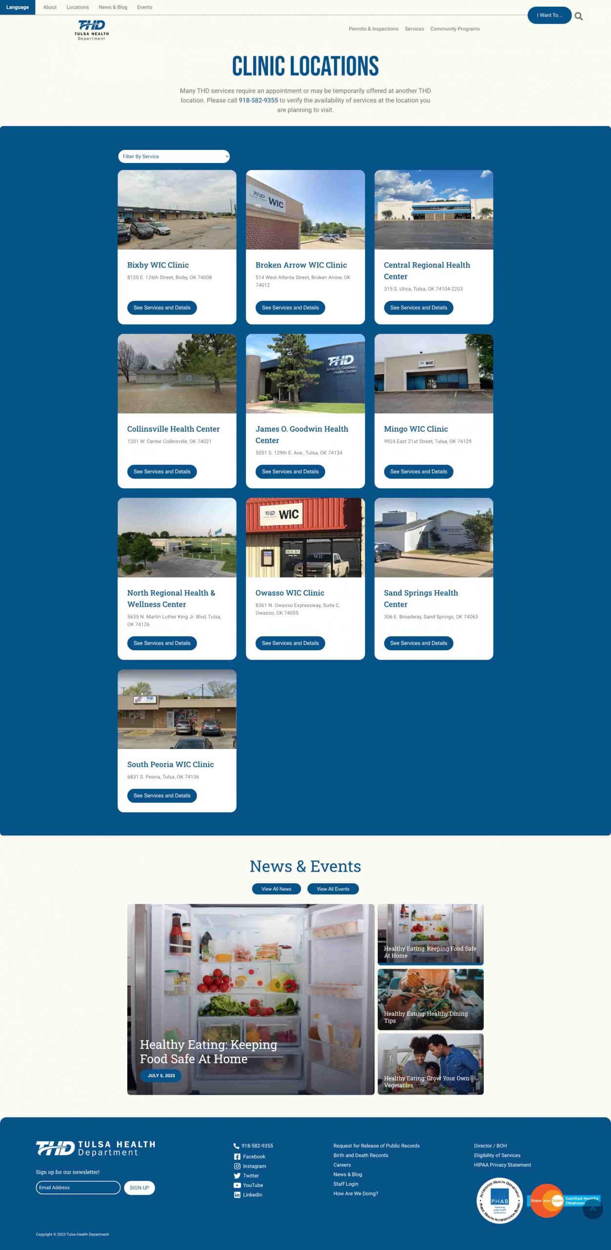
The Solution
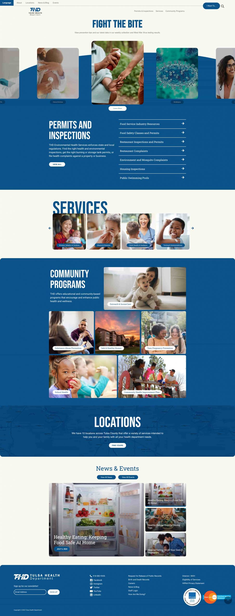
A Modern, Accessible Experience for All
We redesigned the website with a focus on accessibility, clarity, and mobile responsiveness. The new web design simplifies navigation, highlights essential services, and reflects the department’s commitment to community well-being.
Improved Content Structure
Restructured website content into logical, data-driven groups, improving page layouts and overall navigation
Data-Based Search Feature
An auto-fill-inspired search feature was introduced to the primary navigation, quickly highlighting trending search results
Consolidation & Emphasis
Consolidated forms and documents for back-end management and redesigned them for consistency and visibility
The Process
Discovery & Audit
Analyzed the existing site, user behavior, and industry benchmarks to uncover accessibility issues, mobile drop-off points, and content inefficiencies
Audience & Insight Mapping
Identified primary user groups and aligned website structure to their unique needs and behaviors
Content Strategy & Wireframing
Restructured content to match user intent, with wireframes and flows that prioritized clarity, service access, and multilingual inclusivity
Design & Development
Designed and built a modern, ADA-compliant website with clear navigation, improved performance, and a scalable CMS tailored for civic use
Discovery & Audit
Understanding the Digital Barriers
We conducted a comprehensive audit of the existing website by analyzing user behavior, content structure, and organic search performance.
Legacy Site Review & Audit
Assessed structure, navigation, and outdated UI elements to identify pain points and technical limitations
User Behavior Data Analysis
Studied website analytics to pinpoint high bounce rates and mobile usability challenges across key service pages
Industry Benchmarking
Evaluated best practices from leading public health websites to inform accessible, community-first solutions
Audience & Insight Mapping
Serving Tulsa’s Diverse Community
Through stakeholder interviews and data analysis, we identified three primary user groups: Community Residents, Businesses & Vendors, and Public Health Professionals.
These research insights directly informed our content strategy, navigation design, and prioritization of resources across the site.
Community Residents
Seeks clinic locations, immunization schedules, and public updates
Values clear, non-technical language and mobile-friendly layouts
Values quick links to local programs, forms, and resources
Businesses & Vendors
Seeks food safety guidelines and health permit applications
Values step-by-step processes and downloadable forms
Values timely alerts and updates on public health regulations
Health Professionals
Seeks reports, outbreak alerts, and professional documentation
Values organized libraries and easily searchable resources
Values trust, credibility, and collaboration opportunities
Content Strategy & Wireframing
Organizing for Clarity and Accessibility
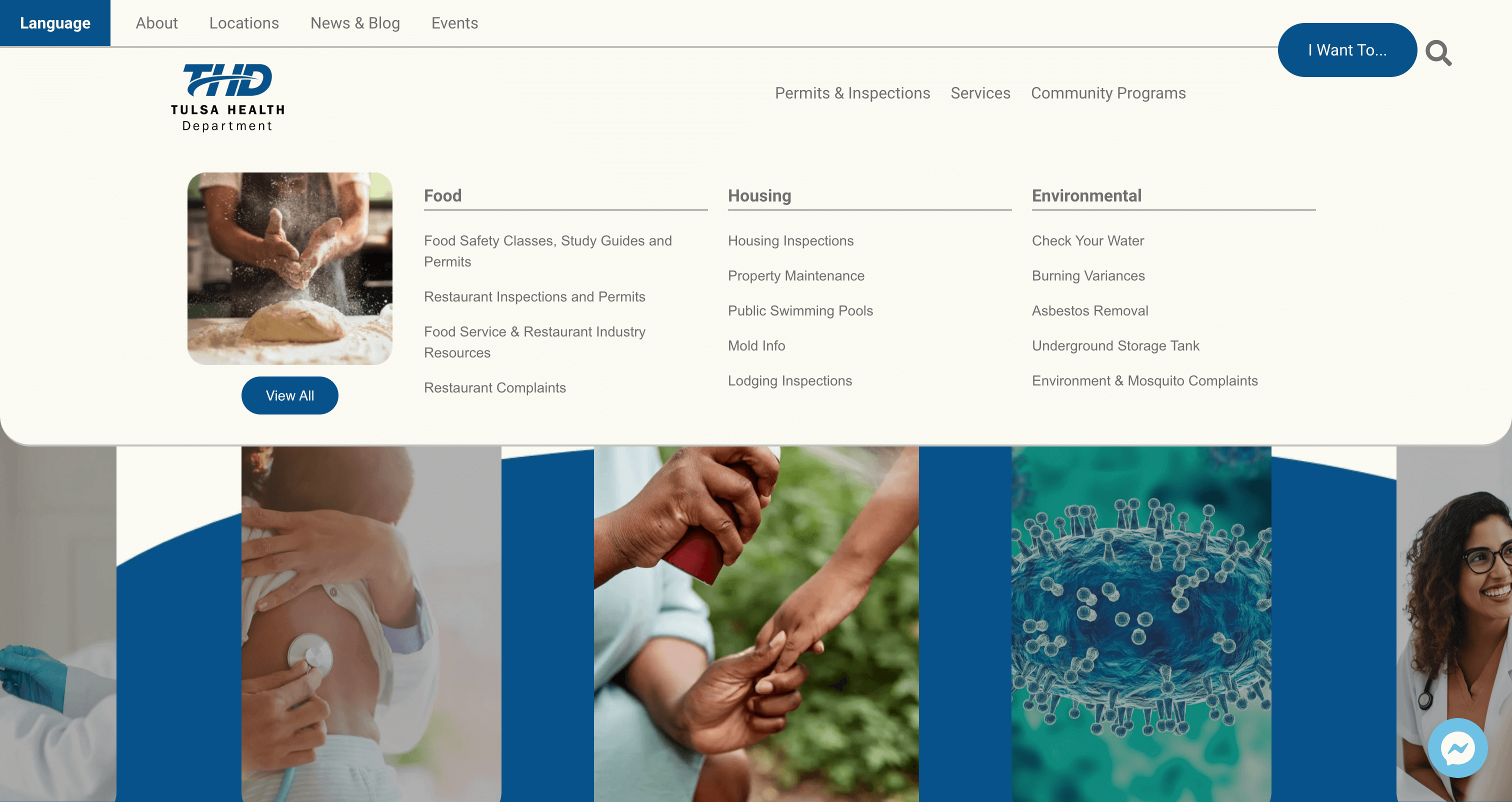
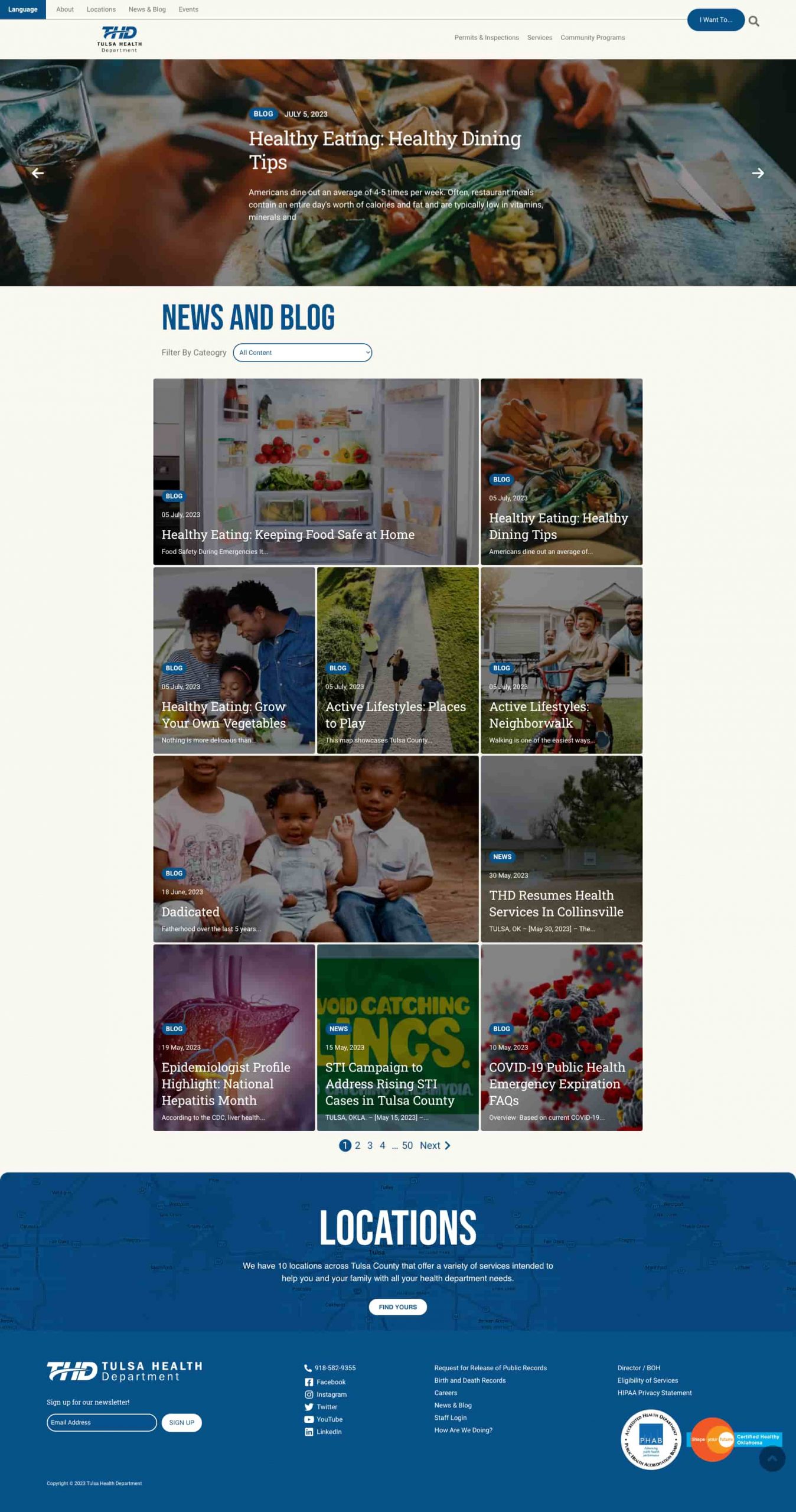
We restructured the website’s information architecture to better reflect user intent. The main navigation was streamlined from five broad categories to three clear ones: Permits & Inspections, Clinic Services, and Community Programs.
To improve access to high-demand resources, we introduced the “I Want To…” search tool: an auto-fill-inspired search feature designed to help users quickly find commonly searched services and take action without navigating through multiple layers.
Key Considerations
Enhance uniformity and emphasis for essential forms and documents
Feature high-traffic resources and programs prominently
Ensure visual hierarchy and accessibility across devices
Low-Fi Wireframes in Adobe XD
Design & Development
Clean, Convenient, and Mobile-Friendly
The new design features modern typography, supportive icons, and accessible color contrasts. We developed a scalable design system that works seamlessly across devices and departments while incorporating subtle nods to Tulsa’s identity through branding and imagery.
Key Considerations
Incorporated easy-to-access call buttons on desktop, tablet, and mobile devices
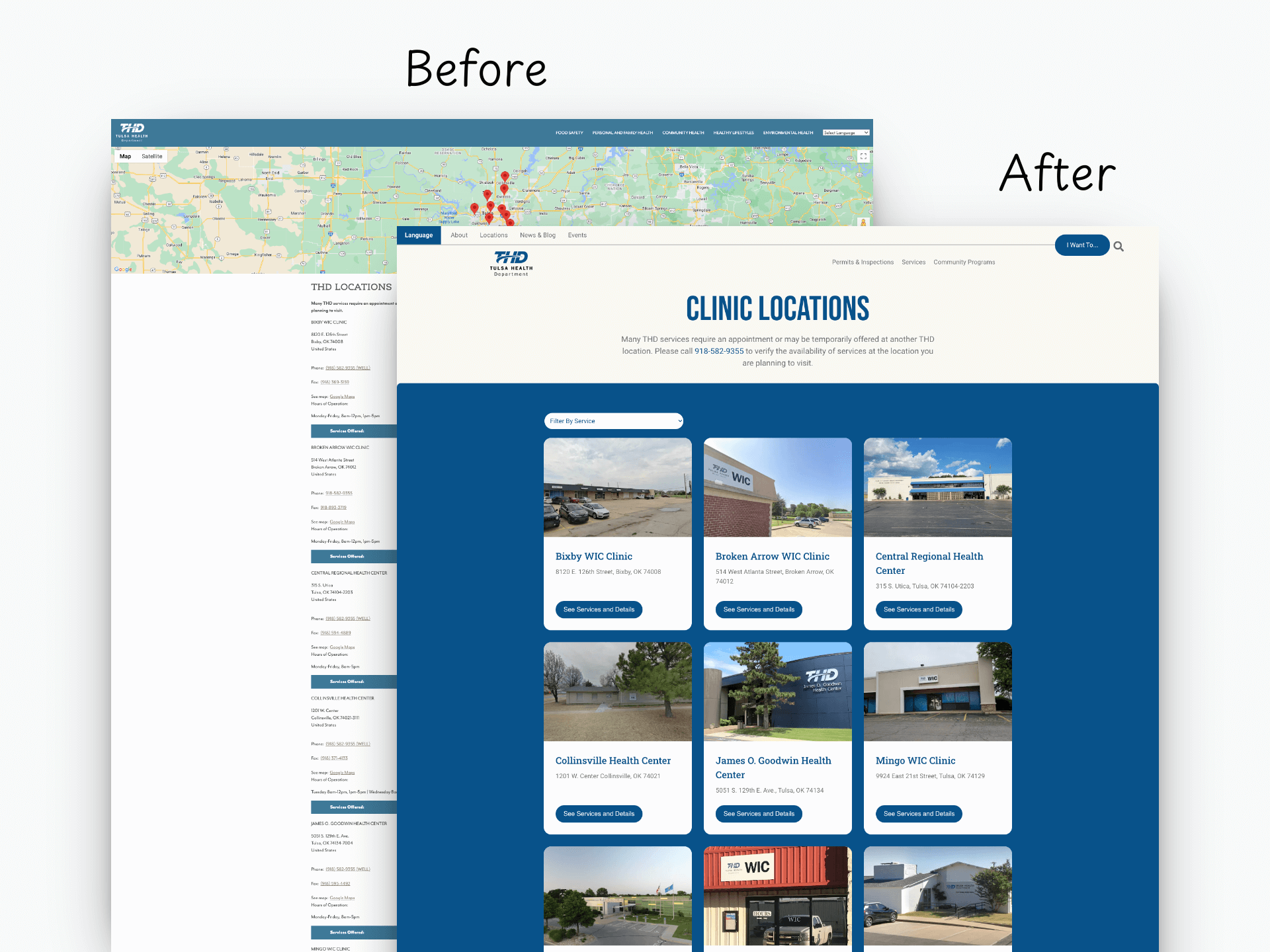
Built dynamic location pages to differentiate clinical services, hours, and requirements for improved service
Increased efficiency of back-end management through resource tagging and filtering
Improved web performance and on-page SEO
Low-Fi Wireframe vs Live Design for Community Programs Page

